A ferocious giant lizard who likes farming, reading, Latin, legal theory, food, gaming, learning languages, making playlists, and frolicking outside.
59 stories
·
3 followers

On Being Orson

1 Comment and 2 Shares

Your course is designed by an instructional designer, and your assessments are graded by computer or by someone in India. The question is — are you still the teacher?

As a professor, I have been designing, delivering, and agonizing over my own classes for 23 years. This didn’t change when I began teaching online 15 years ago. I found the knowledge I needed to create my classes and I did it. I have never used an instructional designer, a design team, a TA, a grader, or anyone who was paid to help me with creating my classes. My knowledge of pedagogy has come from readings and classes I did on my own, and the wonderful people of many professions in my network, many of them online professors and teachers also.

I already argued back in 2011 why communities for online instructors must be led by faculty. Instructional designers, I said, are caught in between the standardization promoted by the institution’s technology decisions and the needs of faculty who want to help their students. I’ve argued against the use of computerized grading. But perhaps the overall message is being missed.

It’s about the role of the professor, especially at a community college.

In addition to teaching, I read a lot of work by PhDs in instructional design and technology, and I keep up with the “innovations” emerging in the proto-commercial educational world. In an exchange awhile back, my Twitter colleague Jennifer Dalby, an instructional designer, made an analogy between teaching a course and a symphony. One person wouldn’t compose, perform and conduct a symphony, so why would the same person both design and teach an online class?

So I thought about this and realized, no, it isn’t like a symphony (although the likes of Beethoven and Mozart did compose, perform and conduct).orson

It’s like making a movie. And I want to be Orson Welles – writer, director, actor. It’s my class. I write it when I create the syllabus and collect the materials. I direct it when I teach and assist students. I act when I’m lecturing or presenting.

But now that we’ve professionalized “instructional design” (and other aspects of education that used to be considered support rather than primary functions), I feel there’s a movement afoot to have me just act. Someone else has a degree that says they are more qualified than I am to design my class, in collaboration with me as the “content expert”. They want to do the writing, create the storyboard, tell me what the “best practices” are.

They are trying to turn me into Leonardo DiCaprio instead of Orson Welles. They want me to profess, to perform, to present, and that’s it. (They’ll record that, so my students can view it later. Others can set up a “course structure” around my performances.)

Well…that’s not OK. As a professor, I do not simply profess – I teach. All the decisions involved in teaching should be made by me. It’s not that I don’t understand the limitations (transferrability concerns, student learning outcomes), but beyond those limits the decisions about which materials to use, and how to use them, and what to have students do, and how to assess that, etc. etc. etc. should be mine. Doing those tasks are teaching.

At community colleges, we have the ideal teaching environment. It’s the one place between the restrictions of the K-12 curriculum dictated by states, and the research-based non-teaching focus of universities. At the university, I suppose some faculty might beg for instructional designers, especially if teaching isn’t what they want to be doing. At community colleges, we have no such pressures – the main job we have is teaching. This shouldn’t change just because we teach online.

dicaprioThere are a couple of risks in letting things continue the way they are heading:

1. Our profession will be de-professionalized. This happens as parts of our job become other professions. It’s like outsourcing key parts of your job. What will happen if they offer a PhD in Assessment? in Attendance? in Essay Assignment Design? Will we all become Leonardo, adding our special touch to the work of others, instead of creating our own?

2. We help perpetuate the myth that teaching online is too hard for ordinary teachers.  It isn’t 1998 anymore. It no longer takes deep technical knowledge to teach online. Instead it takes the desire, a lot of energy and some self-acquired knowledge.  But if we are all told that we need instructional designers and educational technologists to help us, from baby steps to final course, we will become totally dependent and our creativity will be stifled.

3. The courses could become cookie-cutter. The LMS already encourages this. If everyone chooses from the same set of instructional design “best practices” recommendations, variety will be lessened. As individuality succumbs to standardization, students will become more accustomed to the same platforms and approaches, limiting their thinking and their learning.

(And yes, if you’re thinking gosh, this sounds like an anti-MOOC argument, it could be that too…)

Welles demanded, and got, full artistic control of his work. He tried new ideas, acted and produced, worked in different mediums.  No, there aren’t many like Orson Welles (or John Huston or Woody Allen or Robert Redford). But striving to attain that level of creative control should be expected, supported, and applauded in community college education. We should take back our classes and teach them.

Read the whole story
Share this story
Delete
1 public comment
tyrantlizard
4205 days ago
reply
I found this interesting. Many professors need help with things like course design, but I agree that it should be about giving those profs the skills and support to do it themselves, rather than plugging content into best practice templates or letting a non-content expert decide how a course should be organized. Her bit about not outsourcing bits of the profession is bizarre, but she still makes some good points.
A Canadian in Boston

'Interesting' Software Follow-Up: Scrivener, Google's Orphans

1 Comment and 2 Shares
1) Scrivener Guide. 1) Scrivener Guide Over the years, and most recently here, I have extolled the virtues of Scrivener as a major step forward in computerized writing tools. I'm grateful to my friend MG in the United Arab Emirates who has alerted me to a detailed, useful, very well-illustrated online guide to advanced Scrivener use that is available free here.

The guide is by Nicole Dionisio, it's part of the MakeUseOf series, you can download it as a 14MB PDF file, or you can read it on line. In whatever incarnation, it's highly interesting and valuable. Here's how it shows one of Scrivener's advanced features -- setting word-length goals for different chapters or sections of a writing project.
WordCount.png

I don't use this when writing articles with Scrivener, but I have when writing books. Among other things, it helps in setting the daily output targets that are crucial to maintaining sanity through the months-long slog of finishing a very long writing project.

Here's an illustration of another surprisingly useful tool: subtle but immediately recognizable variations in shading to let you compare various revisions in a piece of writing.
RevisionScriv.png

And -- why not? -- here is one more: a name generator. It's a feature that is meant for novelists and that I don't use but which indicates some of the elegant ingenuity of the program.
NameGenerator.png

I have used Scrivener for years but still learned things from this guide. It is particularly useful in clarifying that Scrivener does not aspire to replace the functions of a normal word processor. Indeed, the last step you take before printing out or emailing a document from Scrivener is to export it to Word, for final formatting and spell-checking. Instead its features address the strategic aspects of writing books, academic papers, or long articles: how to keep your research material close at hand, how to organize your arguments, how to keep track of revisions and pentimenti. Check it out.

Thumbnail image for KeepLogo.jpeg2) Google survival rate. I mentioned a few weeks ago that I was wary of Google Keep, an embryonic Evernote competitor, because Google had killed off so many similar interesting-seeming products in the previous months.

The author of the Gwern.net site replies as follows:
I think you may be overly skittish here. I collected data on 350 Google things and ran some statistics on it all.

Results: Only ~1/3 of Google products have ever been killed, and in particular, the 5-year survival estimate for Keep produced by my final model is ~60%, which seems like a pretty reasonable risk to take if the product is useful, and especially given that you correctly point
out that
> 1) Google has often orphaned services, but it has never "disappeared" data. (I am using "to disappear" in the transitive-verb sense familiar from Latin American politics.) It has been a leader in making sure you could make your own copies, or extract, any of your info that was in its part of the cloud.
The loss of Reader is a serious blow to many people including myself, but let's not go overboard and damn Google for worse than it deserves.
The study at the Gwern site is quite a tour de force. I won't attempt to summarize it but will just say, if you're interested in statistical analyses, you will find this interesting. I hope it's right about Keep, but for now Evernote does the job for me.


Read the whole story
Share this story
Delete
1 public comment
tyrantlizard
4274 days ago
reply
For Laura.
A Canadian in Boston

Charting Skill and Chance in the N.F.L. Draft

2 Comments and 5 Shares

Last week we published an interactive graphic about the N.F.L. draft. Our goal was to show an odd reality: even though N.F.L. teams do tend to pick the “best” players early in the draft, there’s a tremendous amount of chance involved. The best 10 eventual N.F.L. performers will not be the first 10 players drafted – or even close.

How to know that both of these are true and decide which is most important? We used draft and performance data from pro-football-reference.com. (One note: N.F.L. performance is hard to measure across positions – how do you decide if a tight end is “better” than a linebacker or a defensive tackle? Most analyses use a combination of games started and pro bowls; the one developed by pro-football-reference uses both of those but has some fine-tuning by position.)

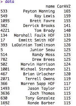
So, for for every pick in the draft, we have one number encompassing their N.F.L. performance. Here are the top 20 since 1995:

image

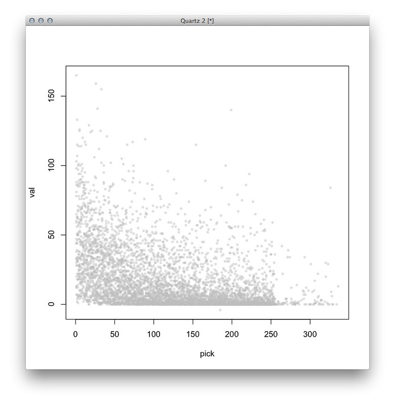
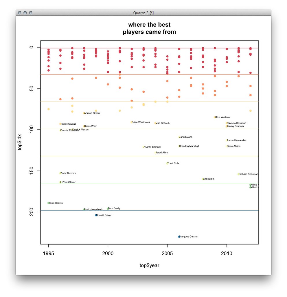
Here’s a first sketch, where every dot represents one player. The Y axis is “how good” every player is, and the X axis is where in the draft they were selected. I actually screwed something up here – there aren’t more than 250 or so picks in a draft – but otherwise the distribution is more or less right:

imageMy colleague Mike Bostock cleaned this up by coloring the picks by round and adding some labels:

image

Although that shows all the data, it’s too noisy to really interpret. Wanting to simplify this, I tried taking the average of all players who went at a certain round and certain pick – here, each dot represents the average value of all players at a certain pick (for example, the players drafted at Round 1, Pick 1, or Round 2, Pick 13). As before, the dots are colored by round:

image

The dot on the top-left represents the average value of all first picks in the draft since 1995 – on average, this group, which includes Peyton Manning, Cam Newton, Andrew Luck, Michael Vick, Keyshawn Johnson and others, clearly outperforms the other picks. (This is might be obvious, but then again, the group also includes Tim Couch and JaMarcus Russell.)

I admit I liked this chart more than I probably should have. (My colleagues corrected me!) Averaging this way is a little misleading because every round doesn’t have the same number of picks (the league has grown and there are extra picks at the end of each round, which leads to some funny business with the math), and hiding the distribution oversimplifies things a little. But this chart does make a simple point – the better players tend to go first.

Instead, Mike offered a boxplot, which shows the distribution without being so noisy:

image

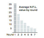
Even this was a little too busy for the point we wanted to make, so we settled for a small bar chart.

image

What we wanted to focus on was the reality that there’s much more randomness in the draft than people realize. Cade Massey and Richard H. Thaler, behavioral psychologists, analyzed the draft and found that not only is there no persistent skill among teams in picking players – teams have good years and bad years in equal measure – but that across all players and positions, teams only picked a player better than the person who went next at that position 52 percent of the time. Their academic paper can ishere, but Massey explained this in a much more accessible way in a recent talk at the Sloan/MIT sports analytics conference.

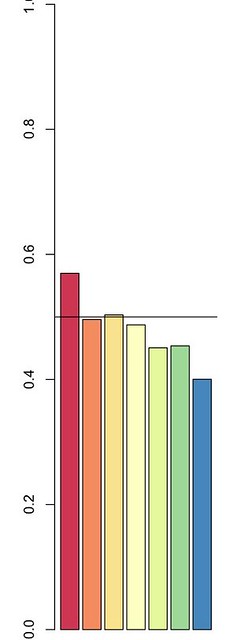
I took a stab at replicating some of their findings just to see what it would look like. Here’s a rough chart of the percentage of teams picking a player who ended up being better than the guy drafted after him at the same position. For example, if you chose Peyton Manning (Pick 1 in the 1998 draft) over Ryan Leaf (Pick 2), your guy is better than the next guy at that position, but if you chose Spergon Wynn (Pick 183 in the 2000 draft) over Tom Brady (Pick 199), you did not. (Sorry, Cleveland Browns.)

image

Simply put, teams don’t pick the “right” player as often as you think, and tend to do better than a coin flip only in the first round. This chart goes under 50 percent after the third round, but that reflects some noise in the data towards the end of the draft – most of these players don’t actually get in the game, so it’s not very meaningful to say that one benchwarmer is marginally better than another. But this concept is hard to explain in a chart like this (the title would be something like “percent of players who were better than the next player at the same position by round”), so we took a simpler approach.

I had been tinkering on a version of a chart I had that showed where the best eventual players were drafted:

image

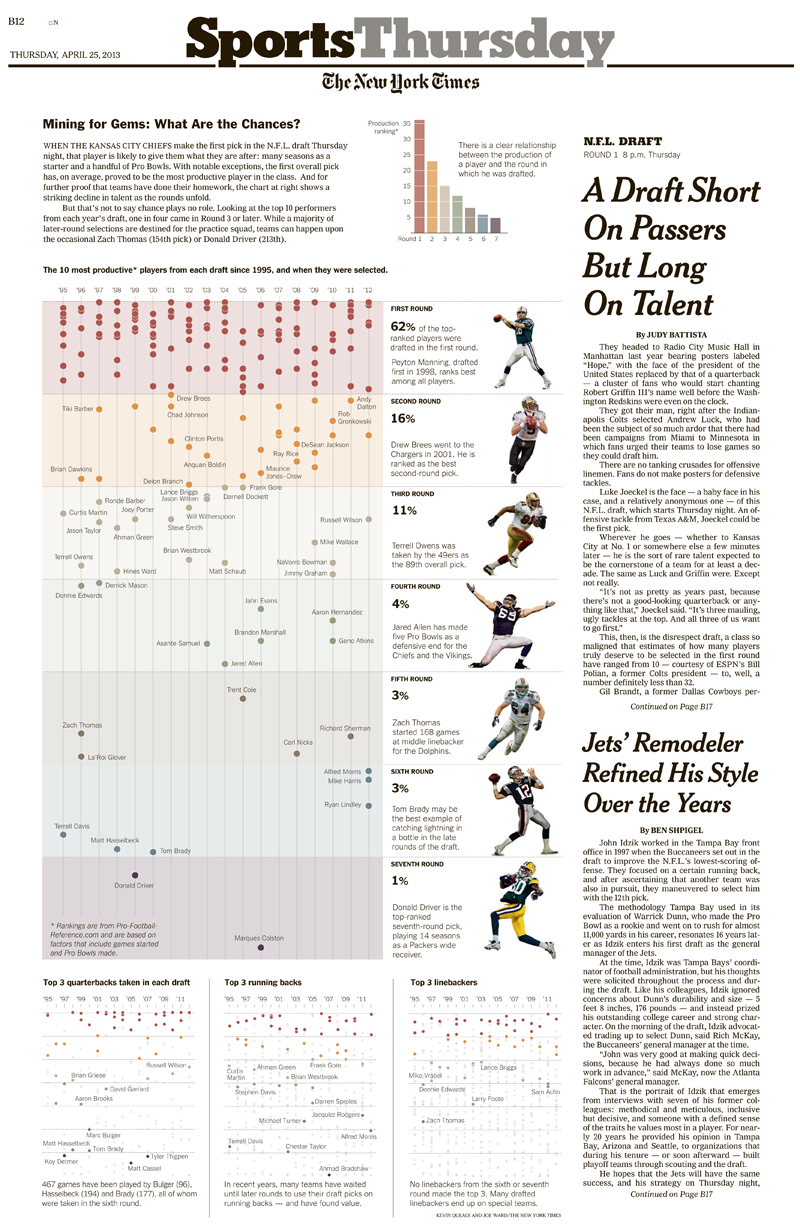
This chart highlights where the 10 “best” players in each draft were picked. My colleague Joe Ward thought it would look good in print, where we have more space, and this chart ended up closely resembling what was eventually printed:

image

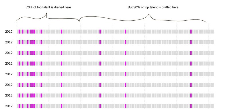
Online, Shan Carter suggested an interface that showed this uncertainty with two sentences: the percent of the best players that came in the first round and the percent that came after:

image

A slider and about a hundred commits later, you have an tool that lets you explore where the best N players from the draft came from every year.

image

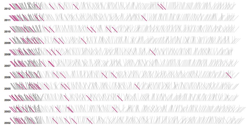
Mike also made a similar implementation based on the Fisher-Yates shuffle, which is a thing I learned about when he showed me, but it wasn’t the right application for this data, and anyway it was getting too late to change our minds:

image

These charts and sketches were made in R and D3. Normally, at the end of these posts, I write about how other people implemented the best parts of this graphic, but this time it’s especially true.

One of the great things about working in a department with a staff of 25 people is that you can be in big trouble three days before something publishes. Then you make a phone call to San Francisco and everything works out fine. fine.

Read the whole story
Share this story
Delete
2 public comments
tyrantlizard
4277 days ago
reply
For Dan and Laura
A Canadian in Boston
Orpho
4276 days ago
There's some assumptions in this chart-making that drives me nuts, and it's about how "good" guys are. Some are good but get traumatically injured on their 1st play and never recover. Some are good but are put into schemes that don't work for them. The structure of the draft (worst team picks first) means that some of the best players are put on the worst teams. Tim Couch might have been good - even great - but he played for the Browns. Put a QB with no one to throw to, no O line, and no RB worth a damn and a decent guy will look and perform terribly. Rating dudes is very post-facto.
samuel
4280 days ago
reply
This is possibly the single best post they've made. It shows the entire thought process, discarded designs, and you can follow it as if you were helping them along the way. I love, love, love this post and it perfectly encapsulates what I loved about the graphics desk at the Times when I had the pleasure of sitting next to them and hearing them work during one of their many late night deadlines.
Cambridge, Massachusetts
digdoug
4280 days ago
I would have stopped at the boxplot, but I've become accustomed to learning what I think communicates data and what people want to see aren't quite the same.
WorldMaker
4279 days ago
I agree Doug. Box plot provides the best and most information at a glance, but it is pretty clear that not everyone learns to read a boxplot.

High Schooler Protests ‘Slut-Shaming’ Abstinence Assembly Despite Alleged Threats From Her Principal

3 Comments and 5 Shares

High school senior Katelyn Campbell

A West Virginia high school student is filing an injunction against her principal, who she claims is threatening to punish her for speaking out against a an factually inaccurate abstinence assembly at her school. Katelyn Campbell, who is the student body vice president at George Washington High School, alleges her principal threatened to call the college where she’s been accepted to report that she has “bad character.”

George Washington High School recently hosted a an conservative speaker, Pam Stenzel, who travels around the country to advocate an abstinence-only approach to teen sexuality. Stenzel has a long history of using inflammatory rhetoric to convince young people that they will face dire consequences for becoming sexually active. At GW’s assembly, Stenzel allegedly told students that “if you take birth control, your mother probably hates you” and “I could look at any one of you in the eyes right now and tell if you’re going to be promiscuous.” She also asserted that condoms aren’t safe, and every instance of sexual contact will lead to a sexually transmitted infection.

Campbell refused to attend the assembly, which was funded by a conservative religious organization called “Believe in West Virginia” and advertised with fliers that proclaimed “God’s plan for sexual purity.” Instead, she filed a complaint with the ACLU and began to speak out about her objections to this type of school-sponsored event. Campbell called Stenzel’s presentation “slut shaming” and said that it made many students uncomfortable.

GW Principal George Aulenbacher, on the other hand, didn’t see anything wrong with hosting Stenzel. “The only way to guarantee safety is abstinence. Sometimes, that can be a touchy topic, but I was not offended by her,” he told the West Virginia Gazette last week.

But it didn’t end with a simple difference of opinion among Campbell and her principal. The high school senior alleges that Aulenbacher threatened to call Wellesley College, where Campbell has been accepted to study in the fall, after she spoke to the press about her objections to the assembly. According to Campbell, her principal said, “How would you feel if I called your college and told them what bad character you have and what a backstabber you are?” Campbell alleges that Aulenbacher continued to berate her in his office, eventually driving her to tears. “He threatened me and my future in order to put forth his own personal agenda and make teachers and students feel they cant speak up because of fear of retaliation,” she said of the incident.

Despite being threatened, Campbell is not backing down. She hopes that filing this injunction will protect her freedom of speech to continue advocating for comprehensive sexual health resources for West Virginia’s youth. “West Virginia has the ninth highest pregnancy rate in the U.S.,” Campbell told the Gazette. “I should be able to be informed in my school what birth control is and how I can get it. With the policy at GW, under George Aulenbacher, information about birth control and sex education has been suppressed. Our nurse wasn’t allowed to talk about where you can get birth control for free in the city of Charleston.”

Campbell’s complaints about her high school reflect a problematic trend across the country. There are serious consequences when figures like Stenzel repeatedly tell young Americans that contraception isn’t safe. Partly because of the scientific misinformation that often pervades abstinence-only curricula, an estimated 60 percent of young adults are misinformed about birth control’s effectiveness — and some of those teens choose not to use it because they assume it won’t make any difference. Predictably, the states that lack adequate sex ed requirements are also the states that have the highest rates of teen pregnancy and STDs.

Some of Campbell’s fellow students at GW High School are also rallying for her cause. They plan to take up the issue at a local board of education meeting, which is scheduled for Thursday evening.

Update

Via Twitter, Wellesley College has confirmed that Campbell doesn’t need to worry about her spot next year:


Read the whole story
Share this story
Delete
3 public comments
tyrantlizard
4281 days ago
reply
The world is terrible, etc. but hey, this girl is awesome.
A Canadian in Boston
Orpho
4281 days ago
True! Also congrats to Wellesley for being, you know, basically decent.
labontea
4292 days ago
reply
This girl is awesome.
washington, dc
Courtney
4293 days ago
reply
Fuck yeah, this girl.
Portland, OR
kway
4293 days ago
Also, I feel like Wellesley would be like "thanks for confirming why we picked her,"

Verizon kills early upgrade program, even for some current customers

1 Comment

Verizon's handset upgrade discounts for customers in a two-year contract will now only be available after the two years are up, rather than after 20 months, the carrier stated Friday. In addition, any "New Every Two" credits that customers may have built up will expire in three days.

Customers with Verizon were formerly able to start looking for and purchasing new phones at new contract prices a few months before their contracts were up. On the downside, customers had to begin new contracts early, but it also meant they had quicker access to newer phones.

Starting with customers whose contracts end a little less than a year from now (January 1, 2014), customers will have to wait out the full two years before they can get the new-contract prices on phone upgrades. Customers whose contracts end before that will still be able to get their early upgrades.

Read 3 remaining paragraphs | Comments

Read the whole story
Share this story
Delete
1 public comment
tyrantlizard
4298 days ago
reply
Boo.
A Canadian in Boston

Two-factor authentication finally heading to Microsoft Accounts

1 Comment

Microsoft Accounts—the credentials used for Hotmail, Outlook.com, the Windows Store, and other Microsoft services—will soon offer two-factor authentication to ensure that accounts can't be compromised through disclosure of the password alone.

Revealed by LiveSide, the two factor authentication will use a phone app—which is already available for Windows Phone, even though the two-factor authentication isn't switched on yet—to generate a random code. This code must be entered alongside the password.

For systems that are used regularly, it's possible to disable the code requirement and allow logging in with the password alone. For systems that only accept passwords, such as e-mail clients, it appears that Microsoft will allow the creation of one-off application-specific passwords.

Read 2 remaining paragraphs | Comments

Read the whole story
Share this story
Delete
1 public comment
tyrantlizard
4300 days ago
reply
Good news.
A Canadian in Boston
Next Page of Stories